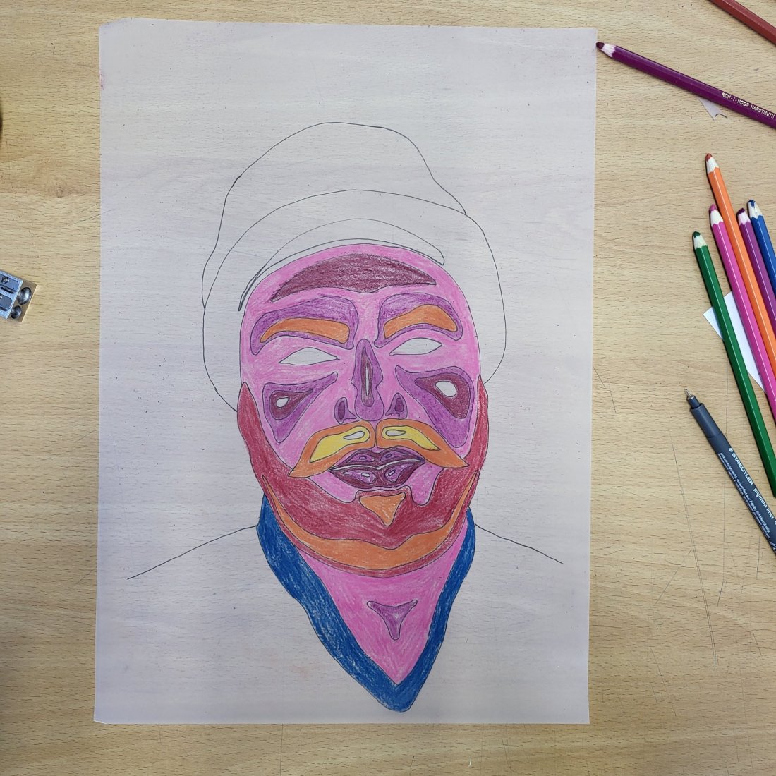
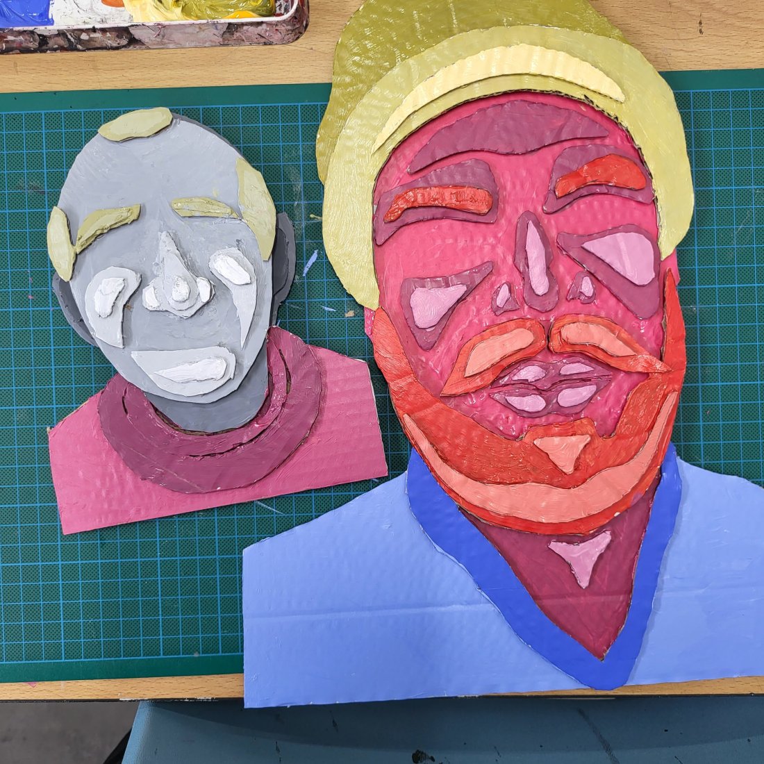
It’s been some time since my last blog post even though i’ve covered alot at college getting into a pattern of writing i’m finding hard to get into a rhythm that i will certainly address over time.
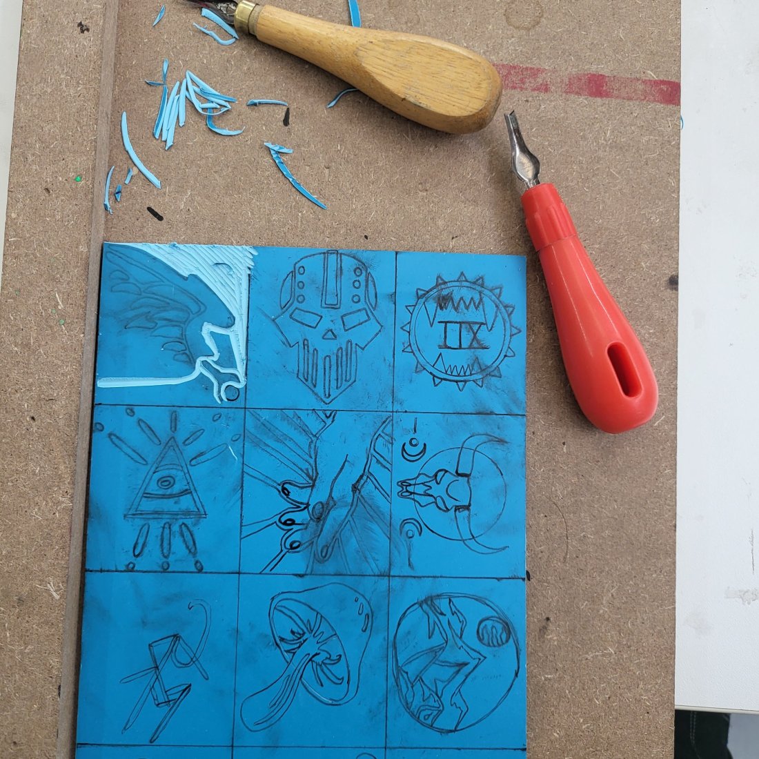
Well lino printing is essentially the process of creating a large stamp.
drawing your desired image directly onto the lino in some form of marker or fineliner just like my experimental images above or using graphite as an impression on transfer or carbon paper to lay the foundation for the next part in the process.
Next stage in the process was grabbing the specific lino cutting tools and carving away at the parts that will become the background leaving the outline or body of the desired images for printing.
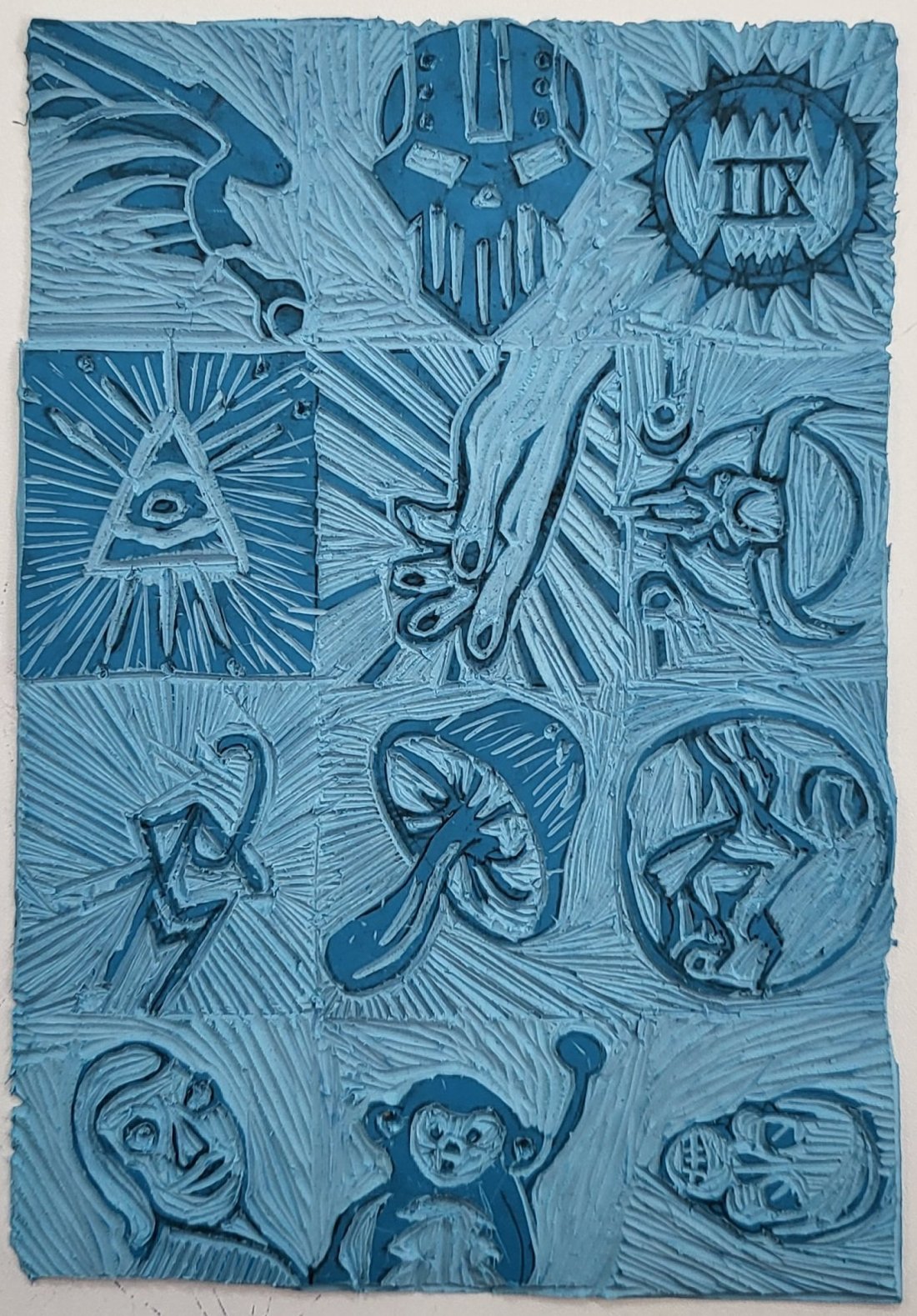
by applying different weight and angles when carving helped change the density and texture of various line work.
with practice I’m sure this can be mastered and applied to future works that will only strengthen the artwork.
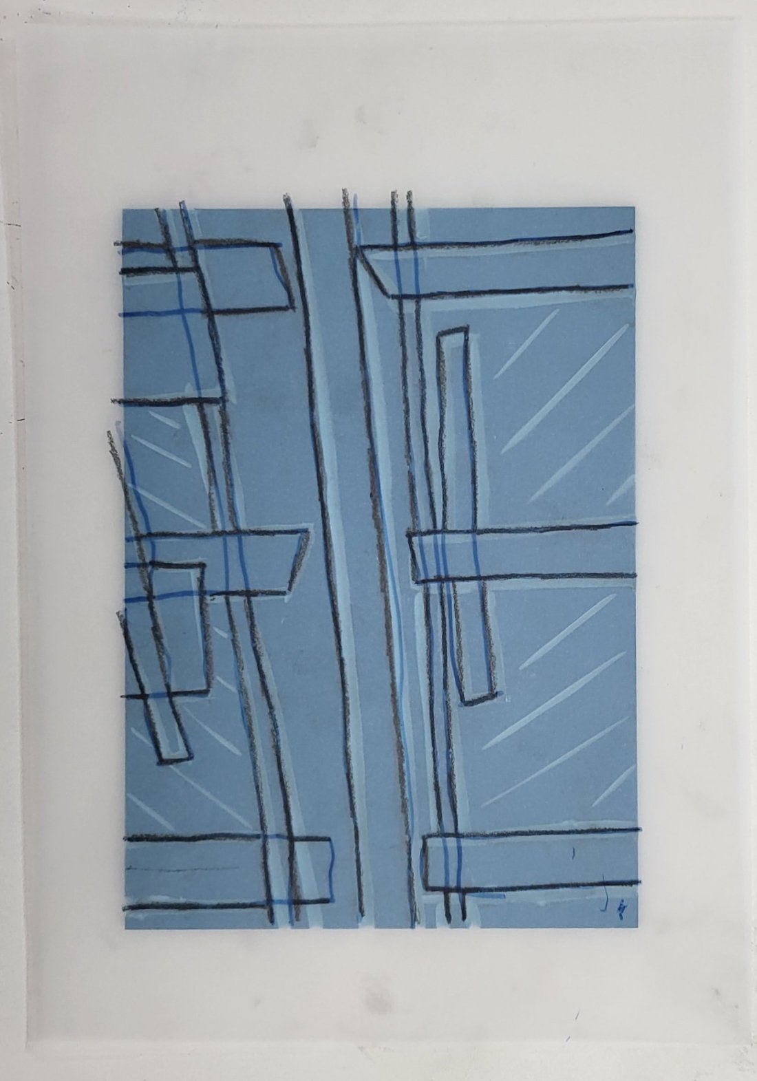
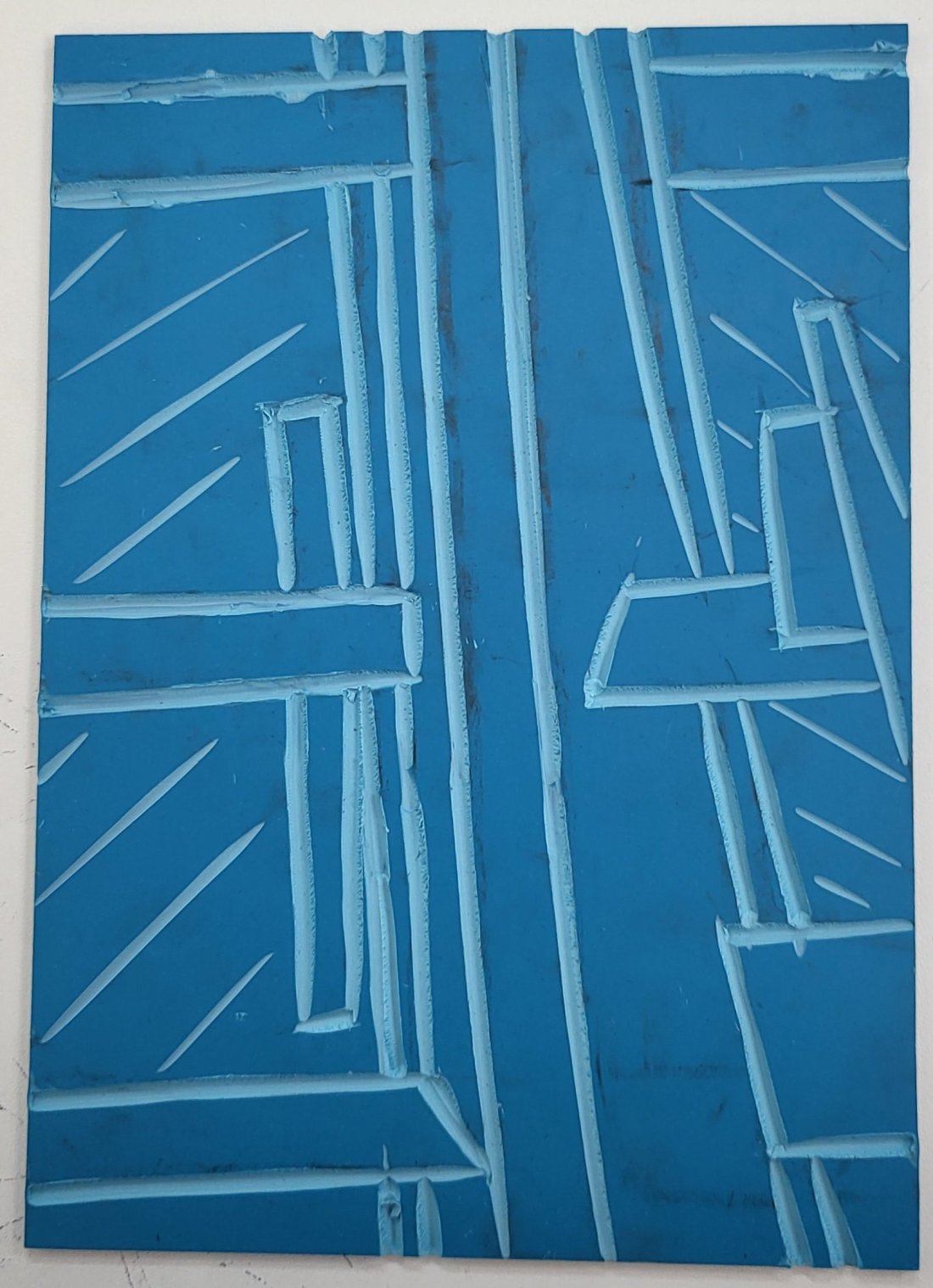
Personally i found all of this process very therapeutic and am excited to continue experimenting with this much further as our main task project is working from contextual research on urban environments and image bellow evolved from a sketch of the side building of the college.
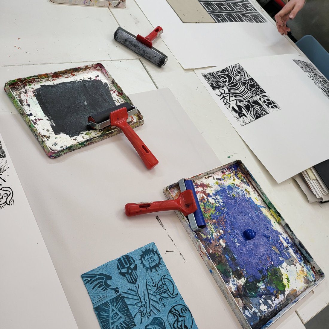
Onto the messy part, taking a roller and evenly applying block printing ink onto the lino but I’d imagine you could no doubt use acrylic for this as a substitute.
Here in the bottom image was my first attempt using just black and i was amazed at the quality for my first attempt as its such a traditional method but has most certainly stood the test of time when it comes to visual impact.
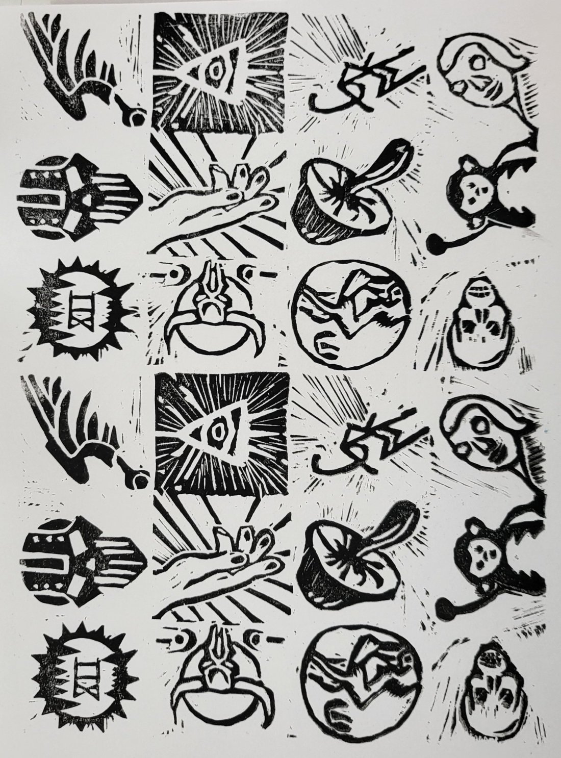
still my mind certainly started thinking what else can be done here and all sorts of mad experiments i didn’t have time to try them all.
For my second try i added a base of navy blue and then applied a scarlet red offset by a millimetre to give a monochromatic 3D esque style which certainly helped a number of my experimental designs visually pop in comparison to the flat black counterpart.
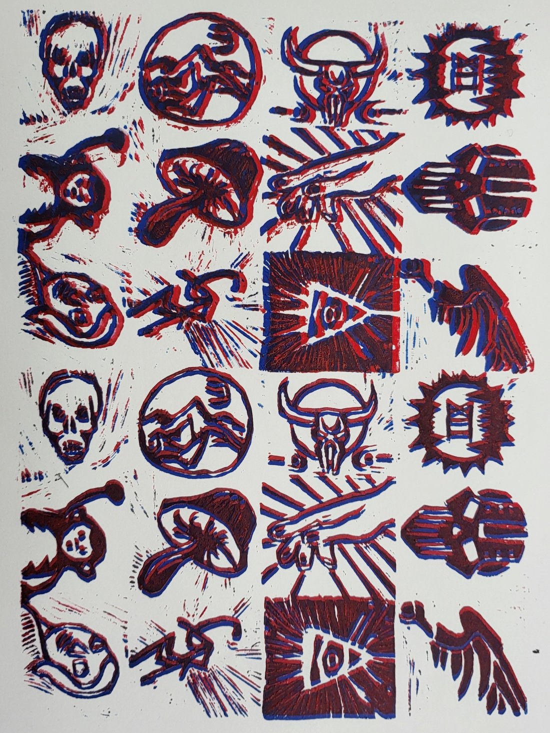
Heading back to the primary project of the urban environmental work we where tasked with making a continuous pattern with our lino but due to the non symmetric nature of mine this was rather tricky so i took my experiment above and transferred it to here.
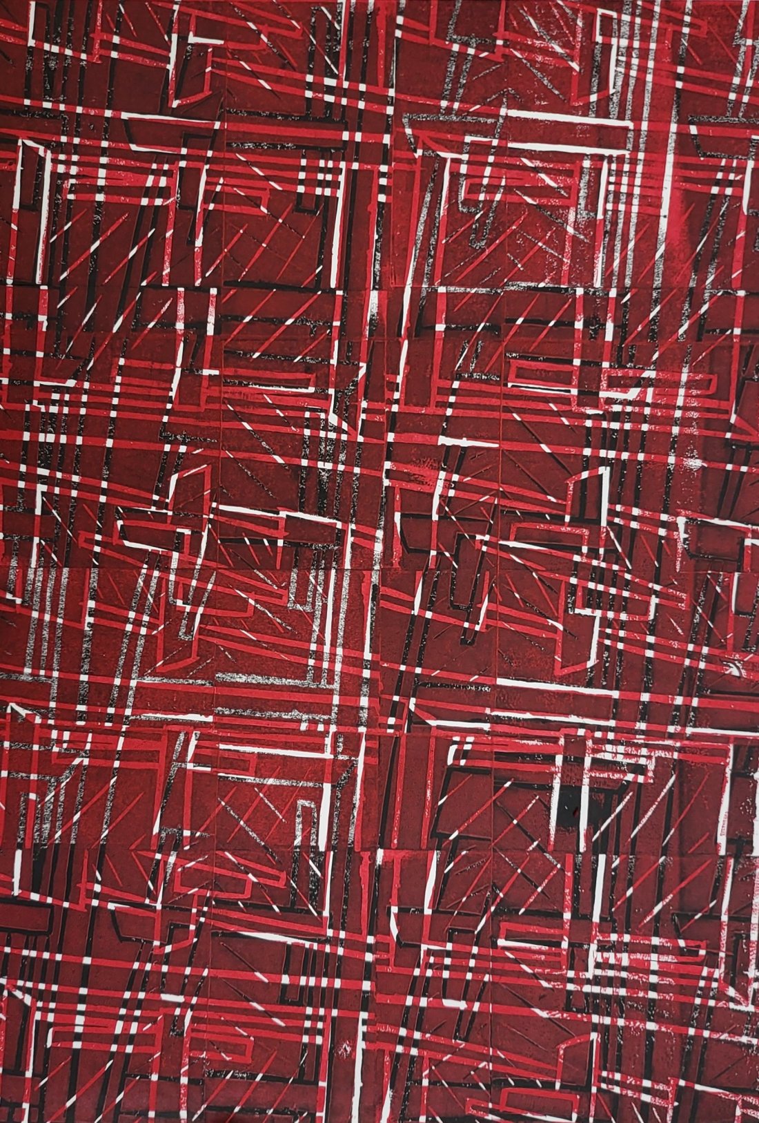
By layering the print in black, red then yellow and rotating the lino from portrait to landscape in-between has helped cover the non symmetry of my piece and has helped portray that mine is interwoven like tartan, this was not done on purpose it was by sheer chance that this was achieved.
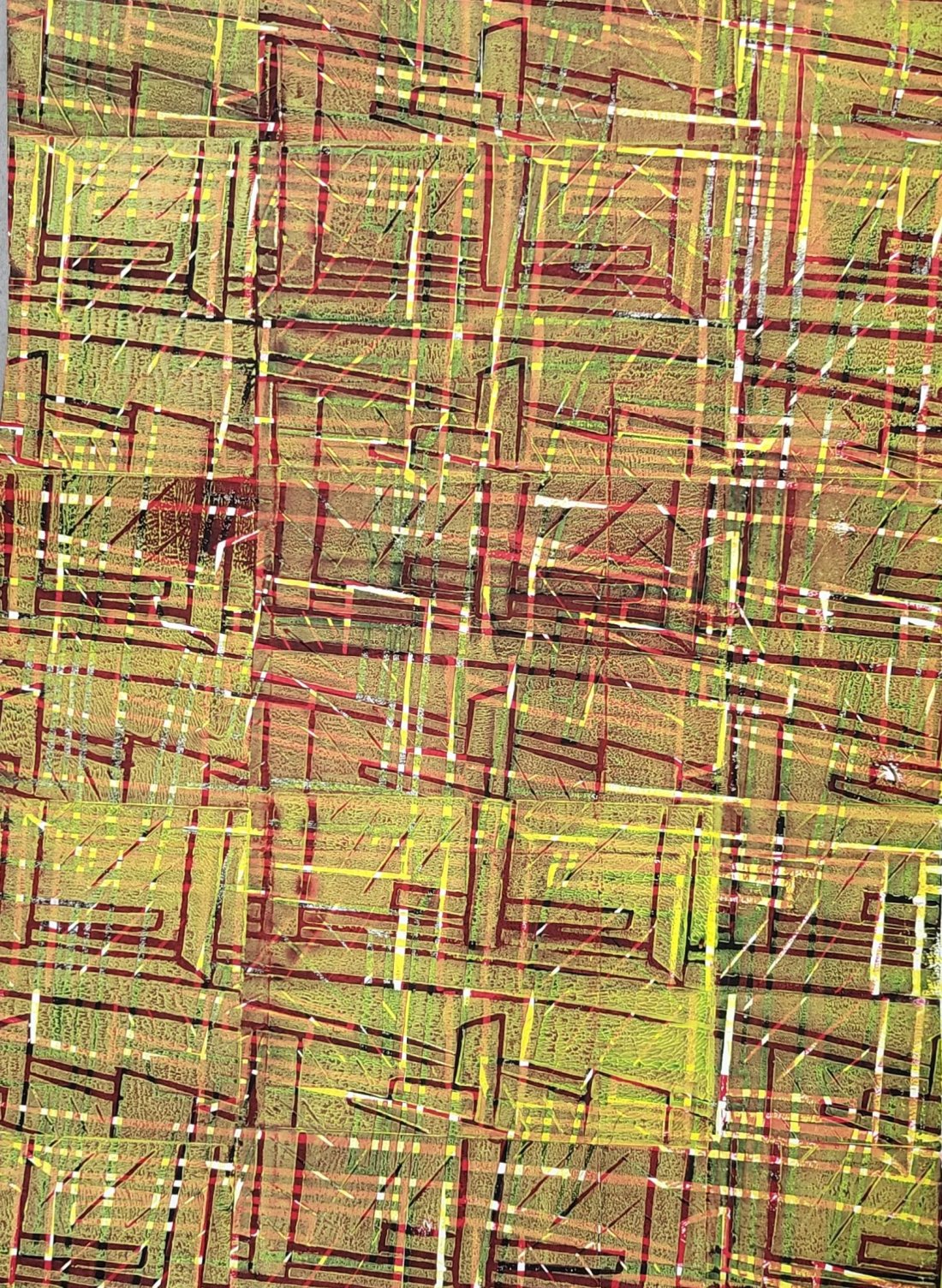
Like all forms of art, experiment have fun and let’s Revolutionise this hobby.
For those who are more visual learners rebecca over at WilhelmMiniatures has done a fantastic tutorial their.
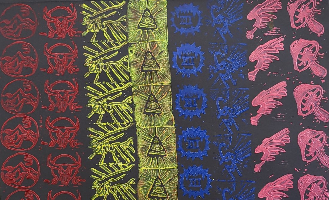
I am in no way an affiliate of this product but you can grab yourself a starter set over on amazon very cheaply and start having as fun as i am.
Remember #Hobbyrevolution if you do make anything, I’d love to check it out.